
This UI/UX Study Case is a team project. We chose this website because we thought that it is a
good representation of most family doctors' websites. The website had not been updated in a while and there
were a bunch of known user pain points which needed to be addressed. Our goal was to improve the user
experience, modernise the aesthetic, and provide better access to the medical services.
My role is
UI/UX Designer and Frontend Developer.

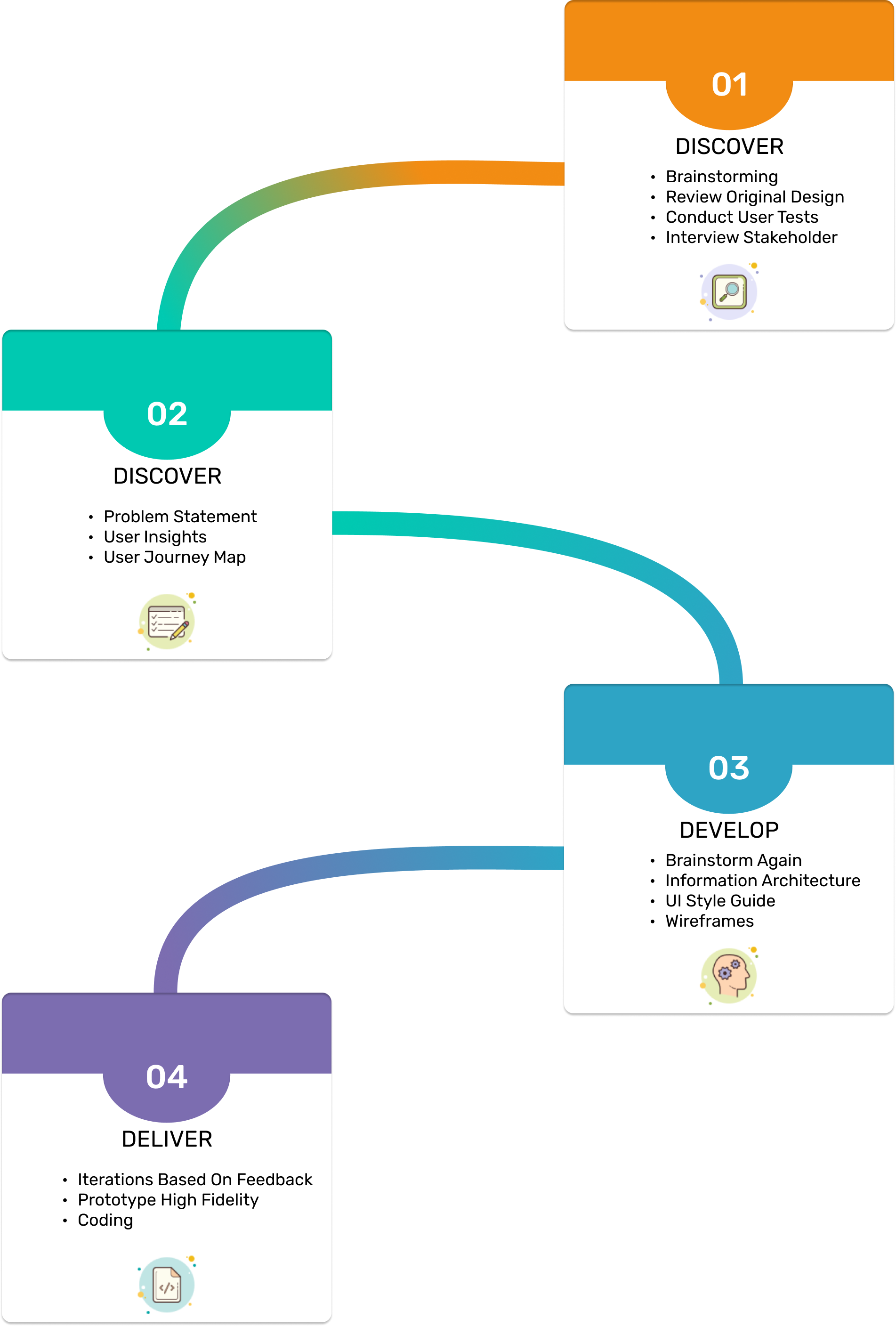
This is our design process:
For the Discover Phase, we did brainstorming, reviewed the original design then
interviewed the stakeholder to get deeper insights.
The Define Phase consisted of making the problem statement and gathering the
user insights.
In the Development Phase, we brainstormed again to check if we were in line with
the user's needs.
In the Delivery Phase, we made high fidelity prototypes and iterated after
receiving feedback from past tests, then coded the final product.

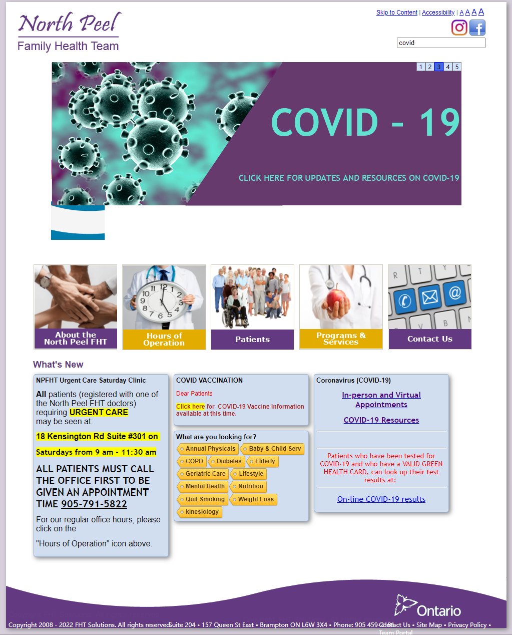
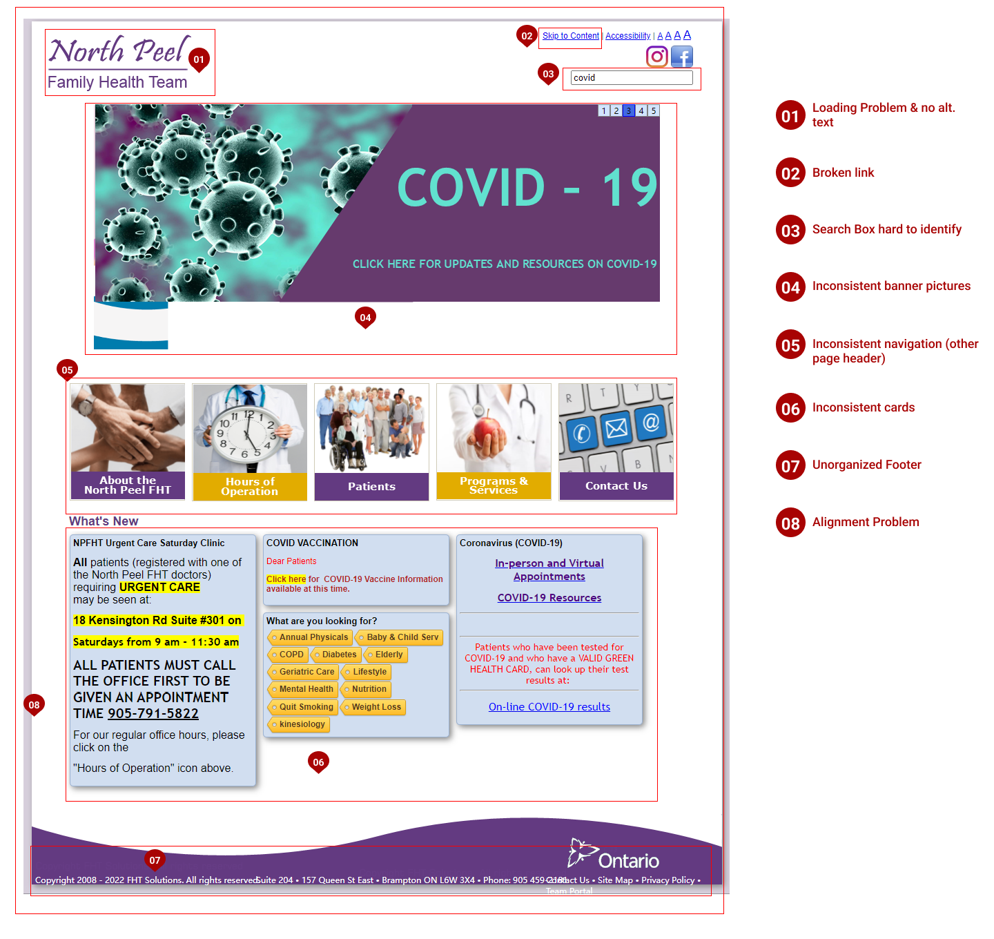
Frist, we conducted the heuristic evaluation and found lots of visual problems including alignment problems, inconsistent designs, and unorganized footer. Moreover, we also discovered several borken links. The problematic website could make the users feel the clinic might be unprofessional and untrustworthy.
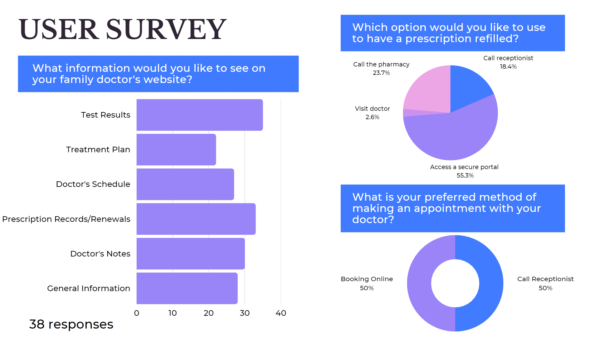
Then, we conducted several user tests and a user survey, from which we received 38 responses.
Overall the results played a big role in prioritizing the features and functionality that later we added to our
design.


During our user research, we discovered that most patients feel the information is lacking from their doctors' websites, they find the process of booking an appointment is inconvenient and would like to have access to their medical information via a secure portal.

How might we improve the website so that our patients will have a better user experience when contacting the family health team to either schedule an appointment, view their health records or access important health and wellness information?

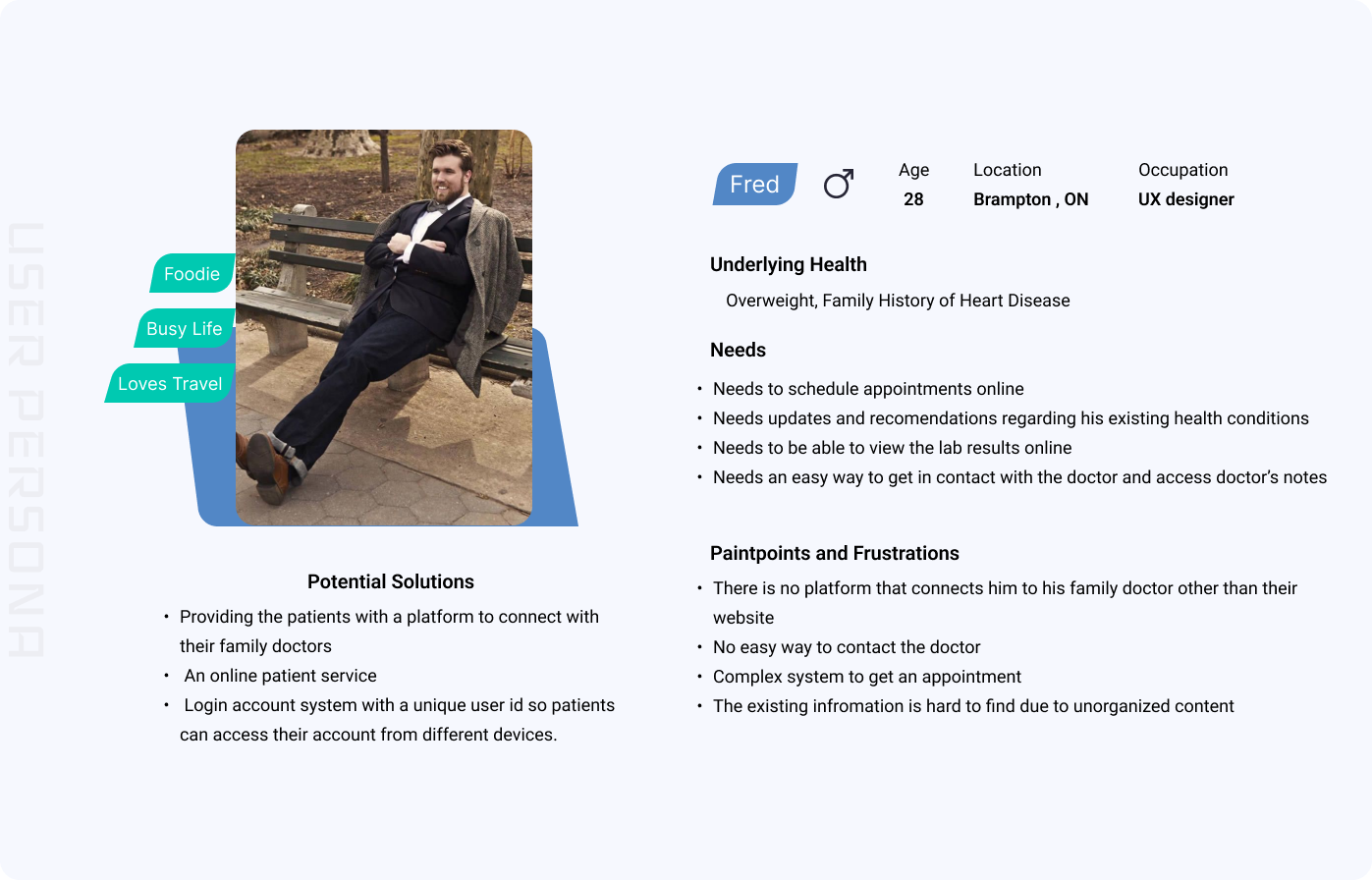
Then we created our user persona Fred who is in his late 20s and has underlying health problems.
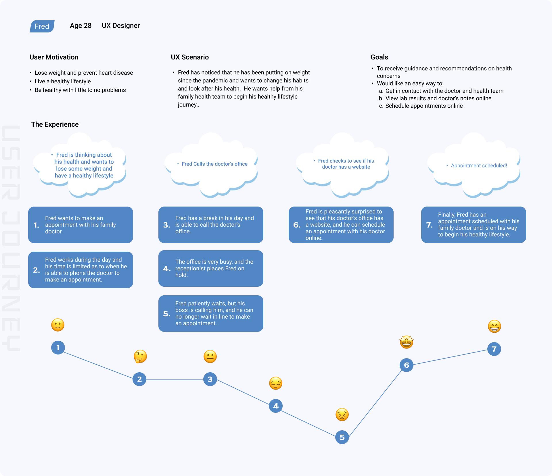
Fred wants to make an appointment with his family doctor but is very busy and has limited time
to make it during the day.
He calls the doctor's office and is placed on hold by the receptionists. He is patiently waiting on hold but
can no longer remain as his boss is looking for him.
He later checks to see if his doctor has a website and is pleasantly surprised that you can book appointments
online.
Finally, Fred has made his appointment and can begin his healthy lifestyle journey!

After we defined the problems, we moved on to the development phase. We started to make our UI style guide because we agreed that it helps design a unified UI for all the design stages.
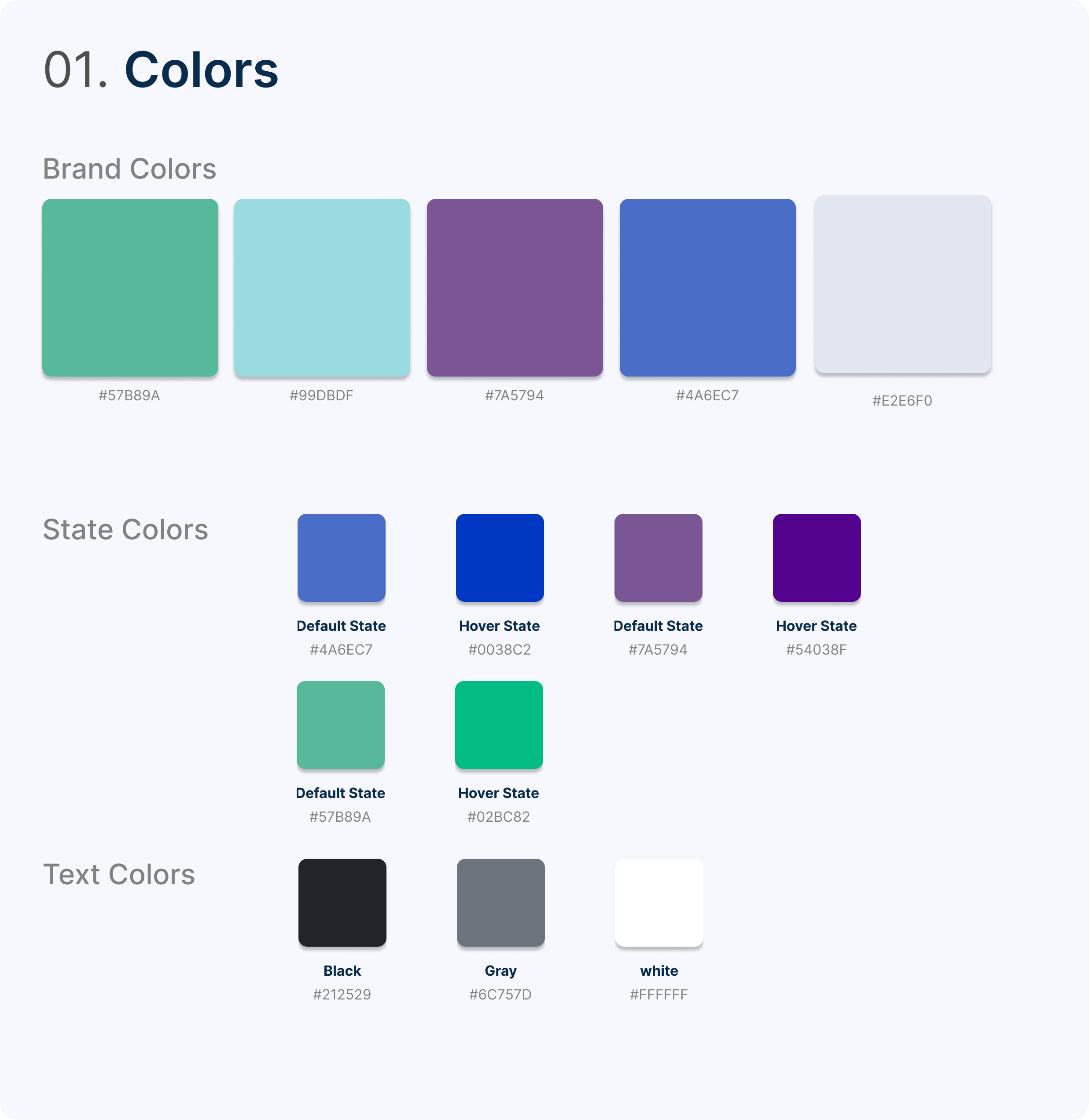
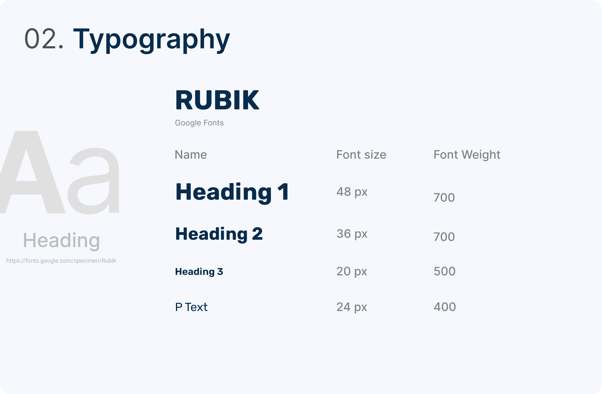

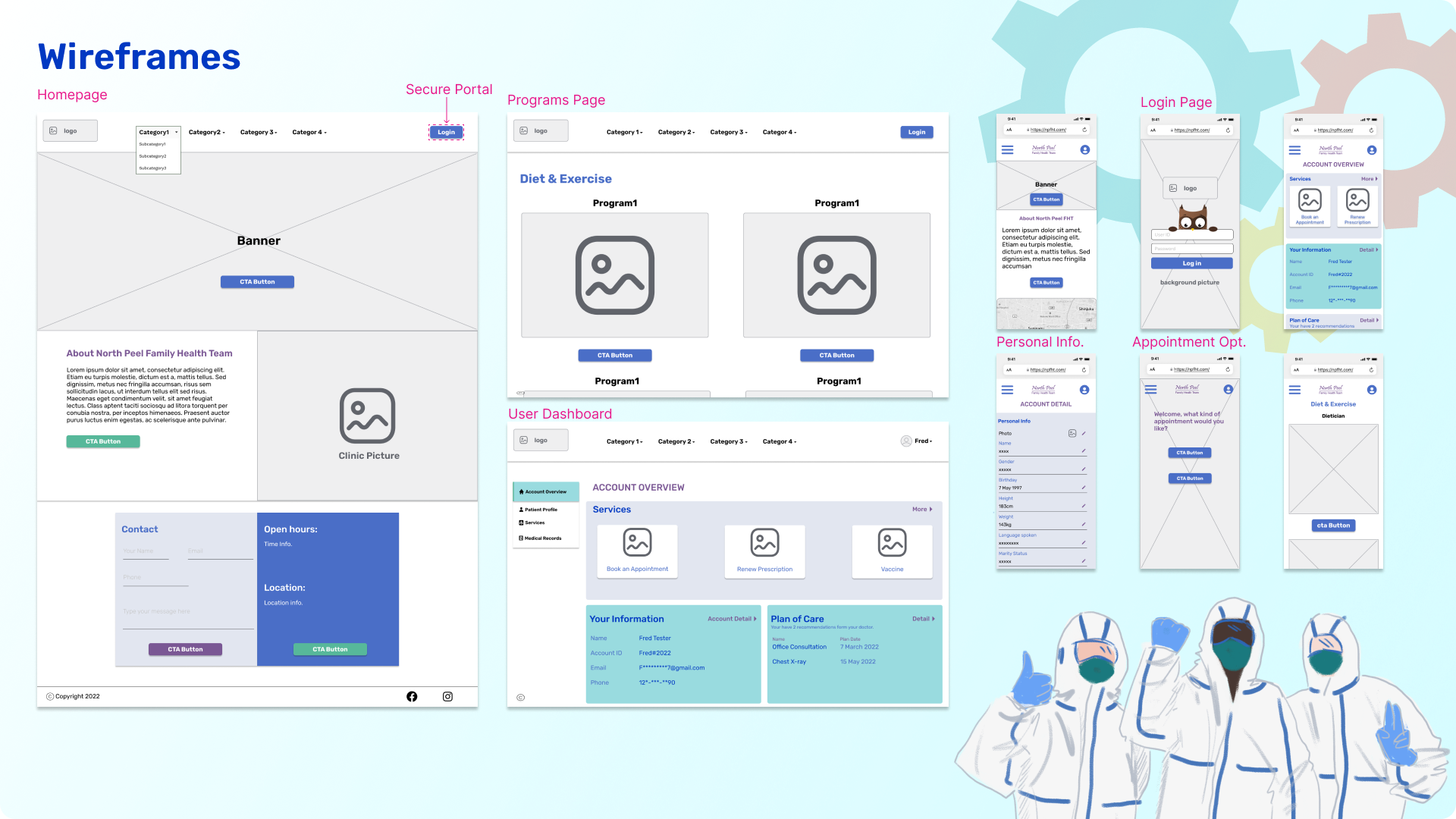
Moving ahead, we sketched a couple of wireframes and added serval new functions. We created a secure portal where users could use their ID and password to log in to their user dashboard. On the dashboard page, users can have access to their medical services and patient profile.
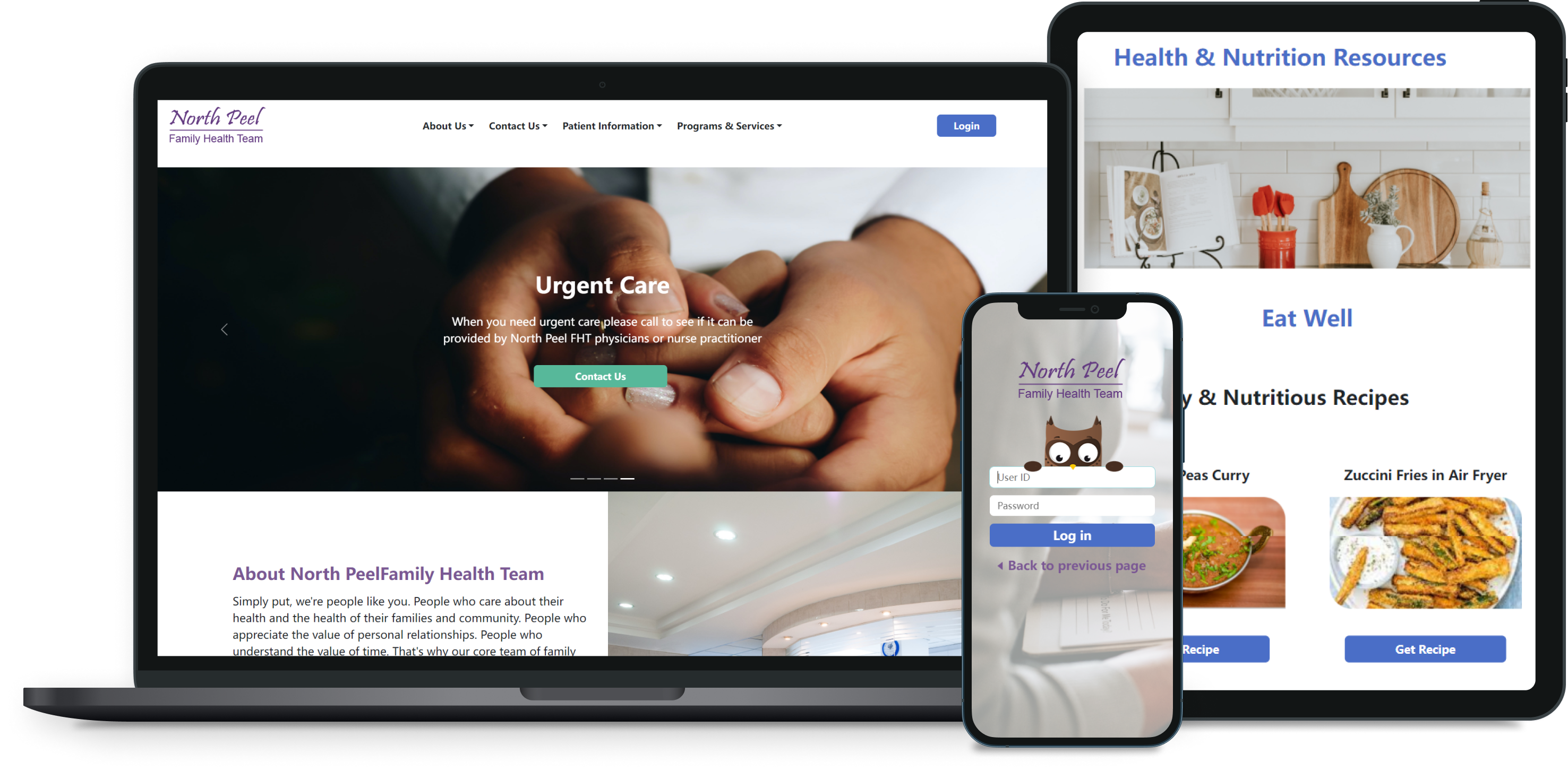
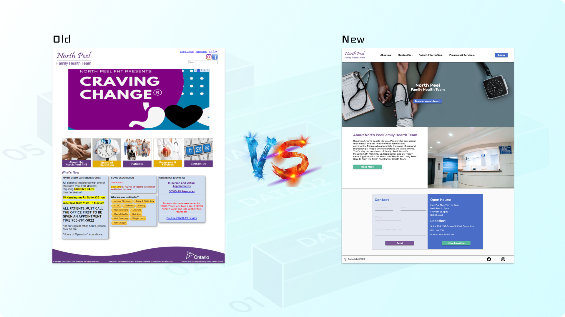
From there, we came up with a proposed design that you see on the right and the existing design on the left.

Once we were happy with the basic concept, we started to add some fidelity to the design so that I could create a clickable prototype.
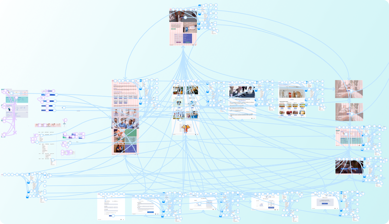
We tested out the prototype and received some informative feedback. One from the positive side is: "I like how the user dashboard shows all my medical and appointment information in one place." As well as a negative one: "After clicking on the 'book an appointment' button on the home screen, why am I asked to click another 'book an appointment button' after login."
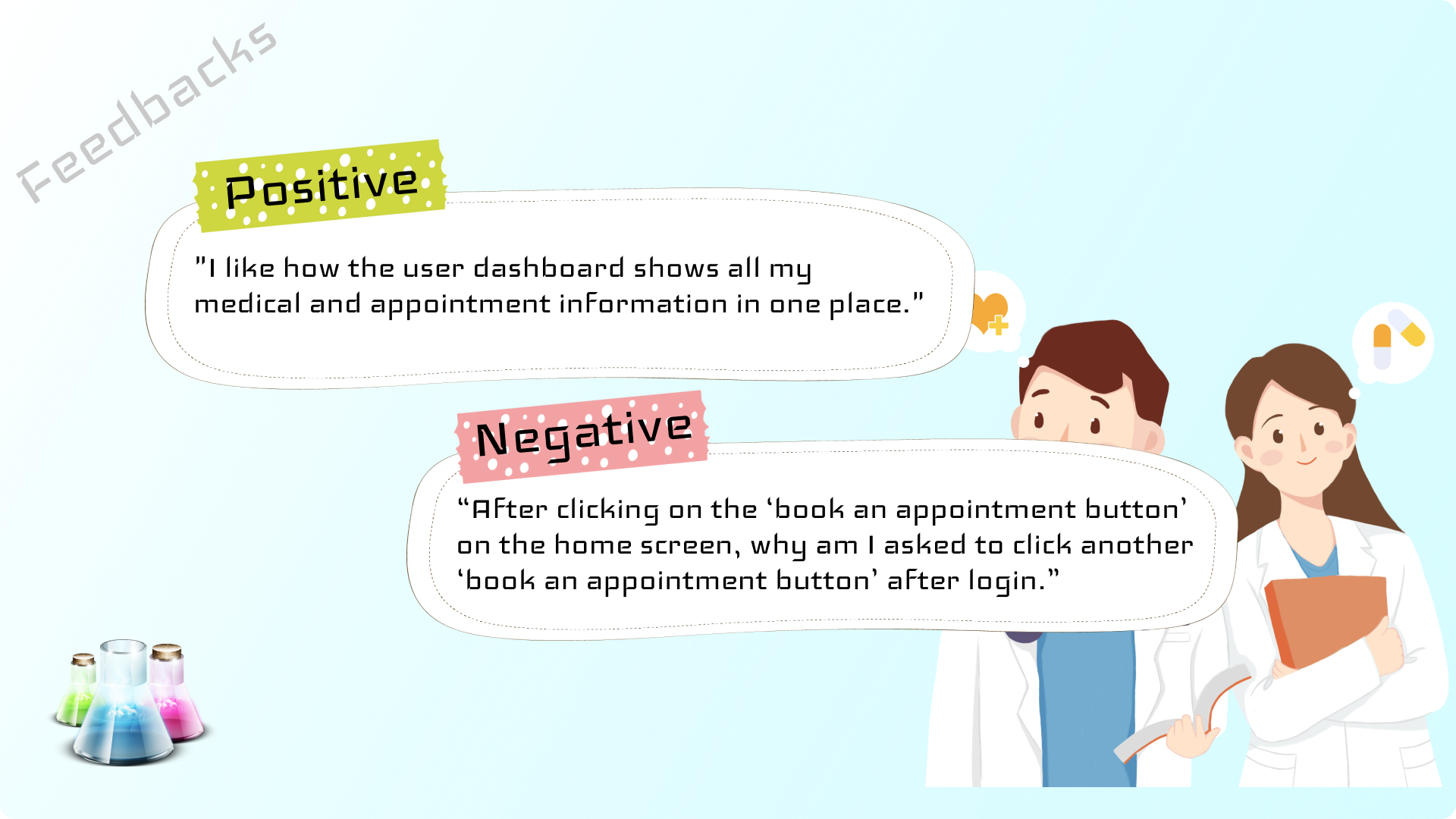

After analyzing the feedback, We made serval iterations to the prototype. For example, the negative feedback mentioned above is a user flow error. To solve that, we removed the unnecessary step to create a direct connection between the login page and the appointment system.
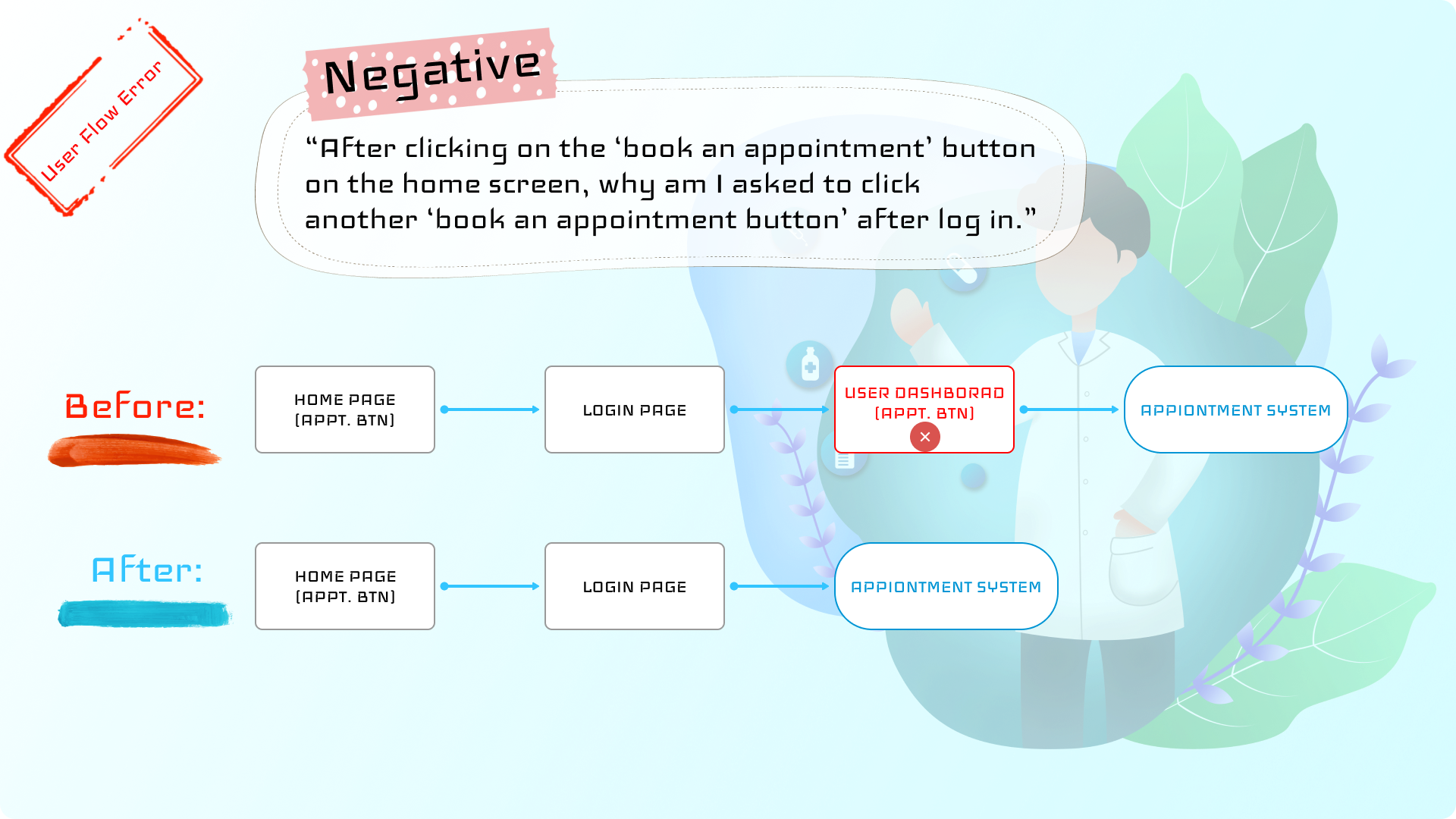
Initially, the home screen had just one hero image, but users thought it would be better to have more information. So, we added more informative hero images with call-to-action buttons to make users' navigation easy.
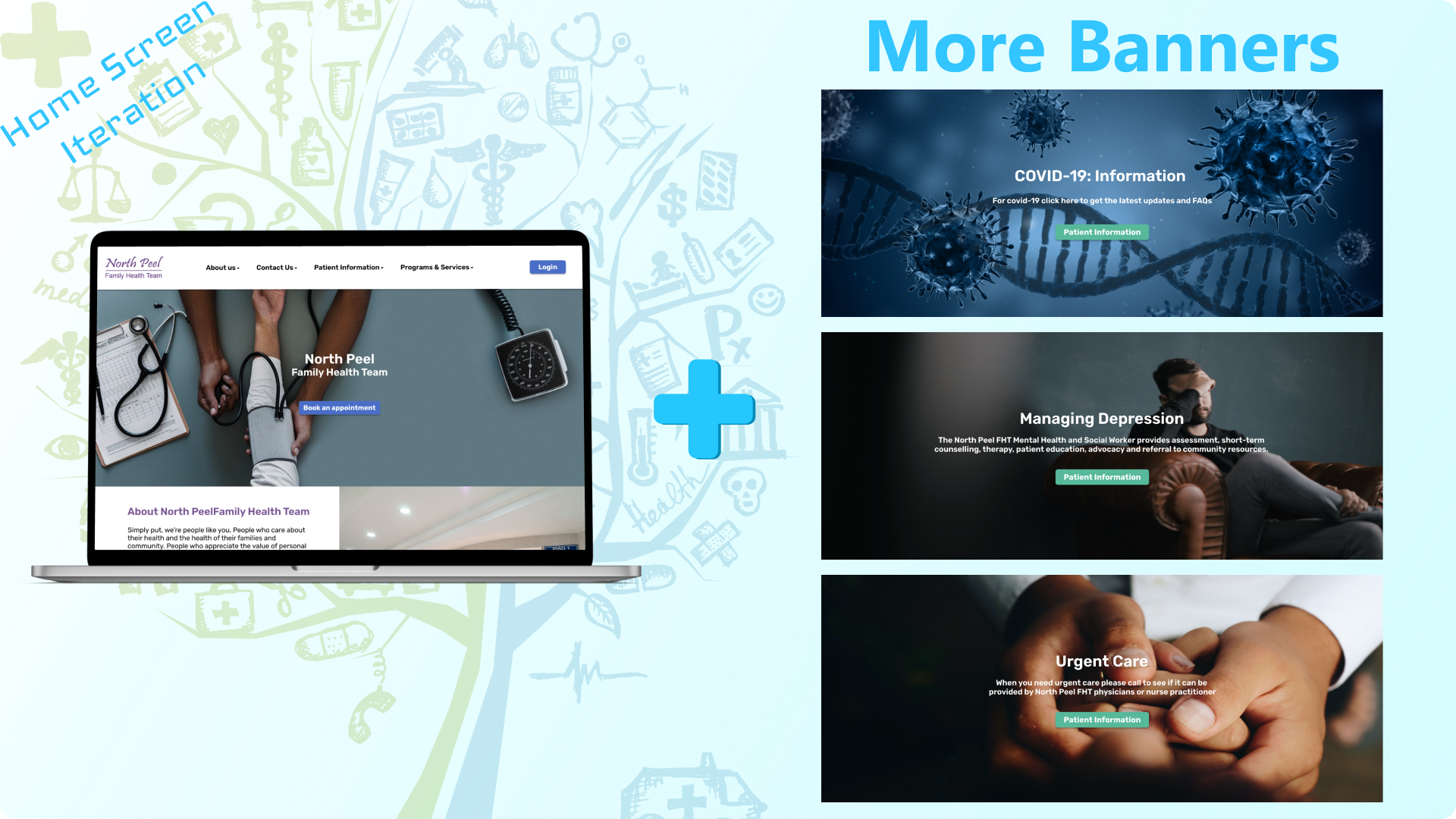
After having more tests and iterations, our website was getting better and more developed. That led us to the last phase.

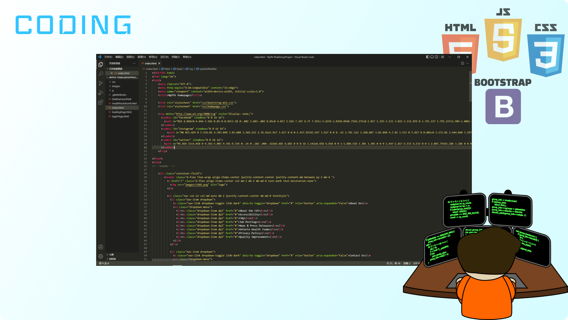
For the coding part, I used "Bootstrap 5" as a structure because it can save much time for the responsive web design.
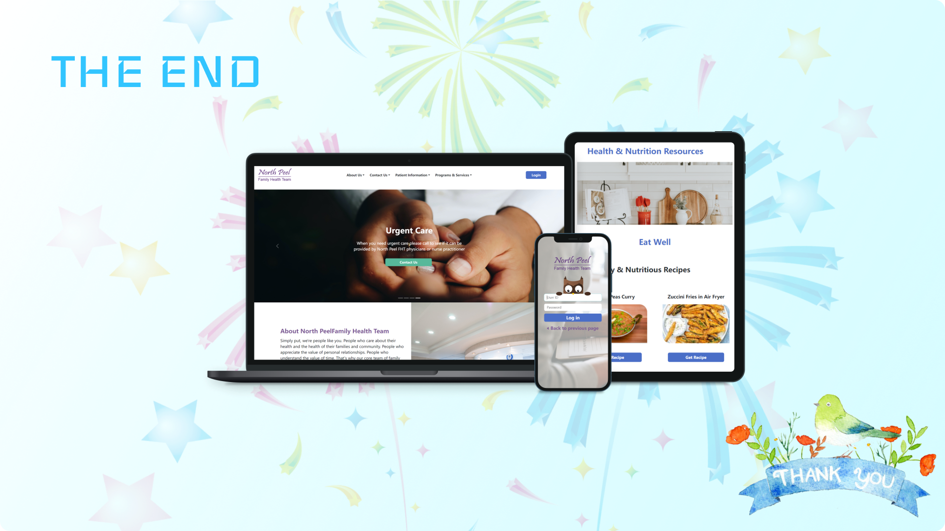
Here is the demonstration of the website redesign.

This project is my first time using the Bootstrap framework, which I found helpful and time-saving for responsive web design. For the front-end aspect, we will continue adding appointment booking flow from the prototype and create an app for family doctors and patient interaction.
